


Clive works at Cyfe. They offer a marketing dashboard that takes all of the guess work out of creating their own visual displays. Click here to learn more about us and to get a free trial.
When it comes to online marketing, your target market is active in many places – from the social networks such as Twitter and Facebook to search engines such as Google. Many business owners are realising that they have to engage in all of the popular spaces online – neglecting one, can mean that your competition may dominate in that sphere, and that you’re simply missing out on sales.
And so you dutifully engage in all of the popular marketing channels online…
However, after a while, things can get confusing.
However, after a while, things can get confusing.
If you have a lot going on it can be really difficult to manage your marketing effectively, and if you don’t know how successful each marketing channel is being, you can’t possibly know where best to spend your time.
What Is A Marketing Dashboard?
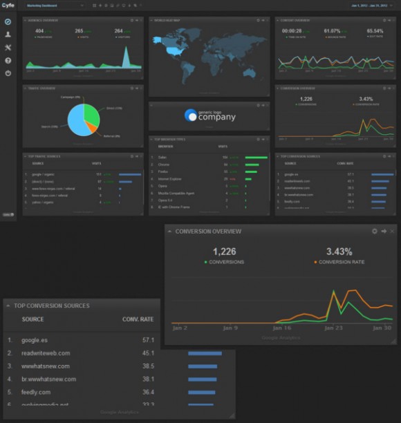
A marketing dashboard is simply a graphical interface that allows you to see an overview of your entire marketing strategy – in a single view. By providing a simple interface through which you are able to view your key performance indicators at a glance you can cut out all of the data that you don’t need.
It is often said that the problem with Analytics is that there is too much information and inexperienced marketers can either get buried or just completely fail to take advantage of the data that is actually useful.
If you set up a dashboard thoughtfully, with your own goals in mind you can avoid these pitfalls – sounds good right? Let’s look at some specifics though; here are six reasons why you need a marketing dashboard for your business.
1. You See the Bigger Picture
When you’re dividing your attention between various marketing campaigns, it’s often hard to see the wood for the trees. The philosophy is to keep shovelling and not worry about it.
Your hard work will mean more visitors and more sales, and you will be invariably right in that respect. However, why all the unnecessary hard work? A marketing dashboard forces you to zoom out and see your overall marketing strategy holistically. A marketing dashboard forces you to see everything from a distance.
Marketers are typically obsessive over details, and that’s not a bad thing, but sometimes we miss the big picture – while being able to see it makes us better at getting results.
2. It Makes Your Marketing More Efficient
When you look at the big picture you will notice trends and patterns that were out of view prior to your dashboard usage. These insights will allow you to allocate more of your energy and budget to the more effective campaigns, which makes your marketing more efficient.
Marketing isn’t just about seeing what works; it’s about realising what doesn’t work and where trends lie. If you notice that a traffic source is declining, then either the strategy needs to be tweaked, or perhaps efforts in that channel need to be withdrawn, so that your resources can be spent in more successful areas.
Trends are far easier to spot on a line graph than looking at a list of numbers. When you compare different sets of data in a comparative line graph, you can focus on the important trends and spot patterns and relationships that you might otherwise miss.
Needless to say, the true power of spotting trends is that they enable you to make predictions. For example, you may be seeing an upward trend in sales generated from Facebook. From that analysis, you may decide to double your advertising budget for the Facebook platform.
If changes happen slowly you might not notice a gradual decline in traffic from Twitter (for instance), but your dashboard will make it obvious and give you time to plan ahead by finding new alternatives or adjusting your Twitter strategy.
3. Monitor and Compare Your Key Performance Indicators (KPIs)
If you manage a website, your KPIs are likely to be numbers of visitors and sales generated. A KPI line graph can show you a comparison of the two. You can see if there are any trends with these two.
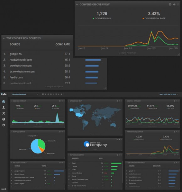
Which KPIs matters the most will depend on your business and there are plenty of things you might choose to track. The charts above show a helpful visualisation of how your conversion rate and your conversion volume might interact and how different traffic sources might convert differently.
If your sales suddenly spike but your overall conversion rate slightly drops you can derive that whatever caused your traffic space sent a slightly lower than usual quality of traffic, or maybe that your website is not well targeted for that particular traffic segment..?
4. Which Marketing Channels are the Most Effective?
When your website is taking in traffic from several sources, you need to be able to track :
• how many visitors each channel brings in
• how many sales are generated from each channel
• the resulting conversion rate using the above two metrics
• how many visitors each channel brings in
• how many sales are generated from each channel
• the resulting conversion rate using the above two metrics
You can plug this data into your dashboard, and then compare each channel to one another. It’s simple really, but if you can directly compare traffic volume, cost of traffic and sales/revenue generated you can easily see which marketing channels are really worth your attention.
5. Conversion Rate Marketing Funnels
A marketing funnel graphic shows you a breakdown of your visitors / leads versus customers, and repeat business. A graphical representation of this data (literally as a funnel) can be quite a striking view, and a focal point that you can shape your improvements in conversion rates around.
This way of viewing your data allows you to quickly see which areas of your website are underperforming, where you are losing the most conversions and therefore where you could perform the easiest improvements.
6. Find Out More About Your Target Market
The more you know about your target market, the better you can serve them. The better you can serve them, the more sales you’re going to make through repeat sales, word of mouth and recommendations.
A marketing dashboard can give you insights into your target market:
• where do they spend the most time online?
• do they respond well to email marketing campaigns
• or are they more active on Facebook?
• are Twitter users more likely to buy on your site than Google Adwords referees?
• do they respond well to email marketing campaigns
• or are they more active on Facebook?
• are Twitter users more likely to buy on your site than Google Adwords referees?
This kind of information can help your tailor your future marketing strategies and help better serve your target market.
You may have an unusually low click-through rate on your email marketing campaign, but strong engagement on Twitter.
While the low click-through rate for your mailings may indicate that the content of the email could be improved, it might simply indicate that your demographic is far less likely to respond to email newsletters in the first place.
The very same market may be far more active on social networks.
This kind of comparison is made a lot easier with a marketing dashboard and without one you may miss the indirect comparison and hence the trend. In this scenario you would likely want to tone down the email marketing and focus on other ways to make contact.
Summary
In simple terms, a dashboard is a tool to help you see what you need to see quickly and efficiently. Certainly you could check all of this stuff via analytics and your various other data sources, but having it in one place saves time.
In simple terms, a dashboard is a tool to help you see what you need to see quickly and efficiently. Certainly you could check all of this stuff via analytics and your various other data sources, but having it in one place saves time.
To really make the most of the opportunity it is important that you only view actionable data. Filter out any stats that don’t have the potential to give you actionable insights.
In other words; when you view a stat, ask yourself “so what?”
You should aim to come up with a simple set of decision questions around each data point. Or in other words: “if this then that”
For example:
If my Twitter traffic does not consistently increase over time then I will reconsider my posting schedule and try alternative platforms.
If my Twitter traffic does not consistently increase over time then I will reconsider my posting schedule and try alternative platforms.
No comments:
Post a Comment