 Over the last few years, Mobile Marketing has become an essential part of the promotional strategy. As a result optimizing your website for mobile devices is now very important since more and more users tend to access the internet via their Smartphones, tablets or mobile devices. In this article we will discuss whymobile optimization is important and we will present the best practices and tips of mobile optimization so as to increase ROI, online revenue and enhance the online interactions with your targeted audience.
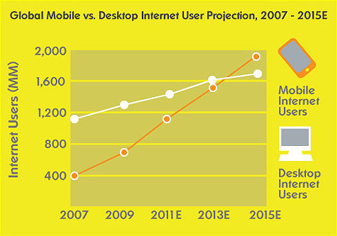
Mobile Browsing will soon overtake Desktop Internet Usage
With Smartphones and tablet devices turning the Internet into a beyond doubt real-time experience, mobile site optimization seems to be an imperative need for businesses to tap into new markets and catch up new trends and needs of today demanding consumers who are always on the move.
People are spending more time than ever on their mobile phones while by 2014 mobile internet is estimatedto overtake Desktop internet use. As a result mobile optimization constitutes a great opportunity yet challenge for marketers to deliver targeted direct messages and a unique online experience through mobile friendly websites.

Mobile friendly sites are not simply designed to fit into small screens but also to interact with the users in the most cost and time effective way. Below you can find the 10 best practices for optimizing your website for mobile devices:
1. Use targeted content & prioritize your Information
Content should be brief and easy to find. Specific and few direct features and information is a must to satisfy user needs. For that reason prioritizing information to lead to conversion is the key action.
2. Simplify Navigation
Visitors should find the information within 3 clicks, while scrolling should be vertical than horizontal withback to top or home indications to facilitate usability. Moreover a search box can speed things up and satisfy users.
3. Size matters
Design with a fluid layout of a minimum width at 320px and implementation of clickable elements big enough for a fingertip, ≈44px² is the best way to facilitate mobile use. Click-to-call constitutes a smart feature for immediate contact.
4. Design matters
Design should be adapted to mobile reality. The best practice indicated is a fluid layout that will adjust to any screen size. More colors or increased contrast constitute an extra assistance to design visibility.
5. Use Call to action
Concerning bid advertisements and banners have in mind that the screen fills easily and such actions are likely to delay loading significantly. For that reason, using targeted short messages upon colourful buttons is the best way to lead your audience to conversion.

6. Interactivity
Mobile reality speaks with real time marketing. For that reason, you need up to date information. Your mobile needs to display the best current offers and news to attract visitor’s eye and interest so as to convert into action.
7. Development
Avoid Flash and Java applets, minimize the use of JavaScript and use instead HTML5 & CSS3. Note that not all browsers support HTML5 features, but they will still accept the HTML5 doctype. This technology seems to be the ideal solution in developing mobile friendly sites, avoiding in that way flash display issues. Furthermore, turn off auto-scaling to ‘inform’ mobile devices that your site is mobile friendly.
8. Duplication of Content – Myth or Reality?
In the case of mobile sites versions duplication of content is a myth. You can keep the most significant points of your site’s desktop version to arouse interest and smooth the progress of finding useful instant information. Google bot-mobile crawls the mobile content to identify the fact that it is a different version. Make sure you identify users that access your website via mobile devices and redirect them to the mobile version of your website. Moreover define mobile Sitemap in Google Webmaster Tools as you would have done for the main website.
9. Testing
Always test your website’s ‘friendliness’ by viewing it with several mobile devices! Note that your website might be presented differently on old devices or on different mobile technologies. Also it is always a good idea to Validate your XHTML on W3C by using the following free service:
http://validator.w3.org/mobile/
10. Location –Domain, Sub domain or redirection?
It is widely believed that applying the same URL for both desktop and mobile version is the most effective and efficient way to introduce your website. However, for technical & SEO reasons it is highly recommended to use subdomains and redirect the user to the mobile version where you shall deliver different – specific mobile content to users.
In brief Mobile Site optimization needs to be smart, creative, targeted and time effective to serve real – time marketing needs and satisfy always moving consumers at any point, at any time and any case!


No comments:
Post a Comment