The design of a website is one of the most important key success factors and it does not only affect theuser experience, but also the SEO campaign. In this article we will discuss the subject of SEO friendly design and we give 30 tips that will help web designers and web developers to build better and more effective websites in terms of both functionality and crawl-ability.
Many people falsely believe that the SEO friendly design is a set of non-sense restrictions that the SEO professionals impose to designers in order to manipulate easier the search engines. Think different. Search Engine Optimization can be described as the implementation of a set of search engine standards that also target on the best possible user experience. Having that statement in mind, it is easy to understand that a good web design is also good for the user.
Optimizing your Web Design
Developing quality content is important but it’s not the only part of your strategy that must be optimized. Displaying the content properly and having a solid hierarchy and easy navigation is the key for an effective web presence.
Tips for user friendly navigation and functionality
1. Discuss with the web design & development team the project specifications. Focus on the feasibilityof the design and have this information in mind before creating the website.
2. Group the content by relevance and use descriptive menu items to help users find easily the information that they are looking for.
3. Use text links in footer to support navigation. Text links are very useful both for the users and for the search engines.
4. Use breadcrumb navigation to allow users keep track of their location within your website and help search engines understand your website structure.
5. Consider each page as a landing page providing all the information to the user and inform him where he is and what to see next.
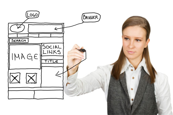
6. Place the logo, the primary message and the navigation above the fold. It is highly recommended to give the best possible first impression to the user.
7. Don’t change the template of your website in every category. It makes the navigation in your website more difficult for the average user.
8. Avoid horizontal scroll, it is not user friendly.
9. A time consuming loading website is a reason for higher bounce rate and lower rankings. Google has clearly stated that page loading speed is a ranking signal.
10. Get familiar with Google webmaster guidelines as it consists of useful tips for better user experience.
11. Avoid Pop ups- and unnecessary use of blurring images as they are annoying for most users.
Content optimization

12. Too long text and/or excessive use of keywords is not a user friendly practice. On the other hand, it can seriously harm the rankings of the page and the image of your brand. That is why in order to avoid such problems you should use the Keyword Analyzer tool and pay attention to the Possible Spam signal in the Keyword Analysis segment.
13. Make use of html heading elements (H1 – H6) to include descriptive headlines and take advantage of their importance for the search engines.
14. Make proper use of relevant images in gif, jpg, or png formats that allow alt text support the online visibility efforts.
15. If you want your text to be crawled and indexed, don’t add it within images or flash elements.
Web Design and Marketing Elements
16. Use clear call to action to ask users to proceed on conversion. You can read more about this in the article “6 Tips for effective call to action”.
17. Make it as simple as possible for the user to understand the process of the conversion.
18. Add value to your website by featuring engaging content that enables users to interact, comment or share.
19. Make the content shareable by incorporating in your design the social media buttons.
20. Use appealing and descriptive images.
21. Always perform a cross culture check for multinational websites. Don`t forget that the menu, in some languages, requires more space than it does in English. Have this in mind before creating the design.
22. Make sure you reserve space for ad banners and don’t forget to use the Standard ad sizes.
23. Use suggestion plugins to provide options to the user and help him visit pages with relevant information.
24. An attractive and user friendly design is more likely to attract links, to rank better, to reduce bounce rate and to increase the average time on site.

Technical aspects of SEO friendly Website
25. Don`t build full flash websites. Use JavaScript and jquery plugins to achieve the same effect when possible.
26. Avoid using flash for navigation.
27. Avoid the excessive use of JavaScript and AJAX. They should be used to improve the user experience (achieve flash-like effects etc) but they should not be required in order to view the website. Keep in mind that some mobile devices have problems with javascript.
28. Make sure that the design fits to the standard screen resolution. Typically you should design the websites for 1024×768 screens. Also you can use your Google Analytics statistics to see what screen resolution is used by most of your visitors.
29. Test various browsers to ensure the proper rendering of your design and make your site cross browser.
30. Deactivate flash and other plugins to see the content as a search spider does. Alternatively you can use the Spider View feature of the Web SEO Analysis tool.
Last but not least you should not forget that the ability to understand and recognize what is best for the users, instead of focusing only on search engine bots, is what will help you improve your conversion ratesand increase your sales. A good design, a well written content and a solid SEO campaign can coexist in within the same website.
Your input is valuable! Feel free to share your opinion based on your experience and knowledge.


No comments:
Post a Comment